

Basic Elements of Graphic Design
Graphic design is much more than just displaying interactive elements online or making certain web pages prettier. It is a true craft allowing professionals to show their mastery and breathe life into visual content. Although today this art is most often associated with the digital world, in fact, it is quite ancient, dating back to the first drawings found in caves and pyramids. However, modern advancement connects the two worlds -physical and virtual, helping designers reach new heights in their field.
In this article, we will explain the basic elements of graphic design and how they deliver magic when combined properly. Learn how to use simple elements to create visceral logos, brand identities, to simply deliver messages, or tell whole stories. And all of that requires:
- Lines, shapes, and patterns
- Colours, shades, and nuances
- Texture, fonts, and typefaces
- Spaces, fillings, and images.
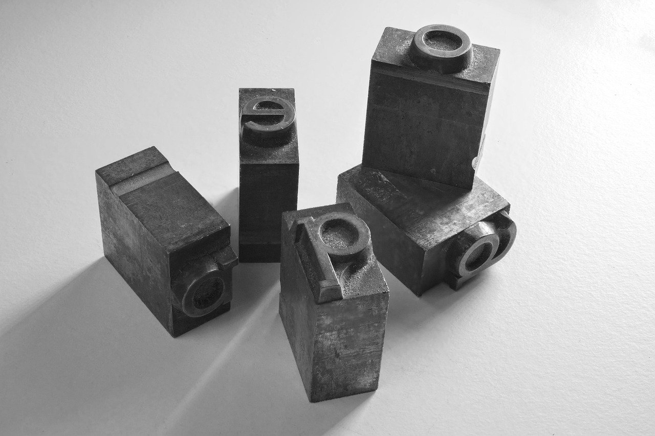
Lines & Shapes
Let’s begin with the lines, the simplest graphic design elements. They could be vertical, horizontal, or diagonal according to their direction, but also curved, wavy, straight, implied, solid, and broken. Lines can form patterns, like zig-zag, cross-hatched, stripes, etc. On the other hand, graphic designers often use shapes. We can determine two main types – organic and geometric. The main difference is that the first type can be asymmetrical as well, while the second only symmetrical in either 2D or 3D forms. Natural and abstract shapes are organic, while triangles, cubes, squares, circles, pyramids, etc., are geometric.
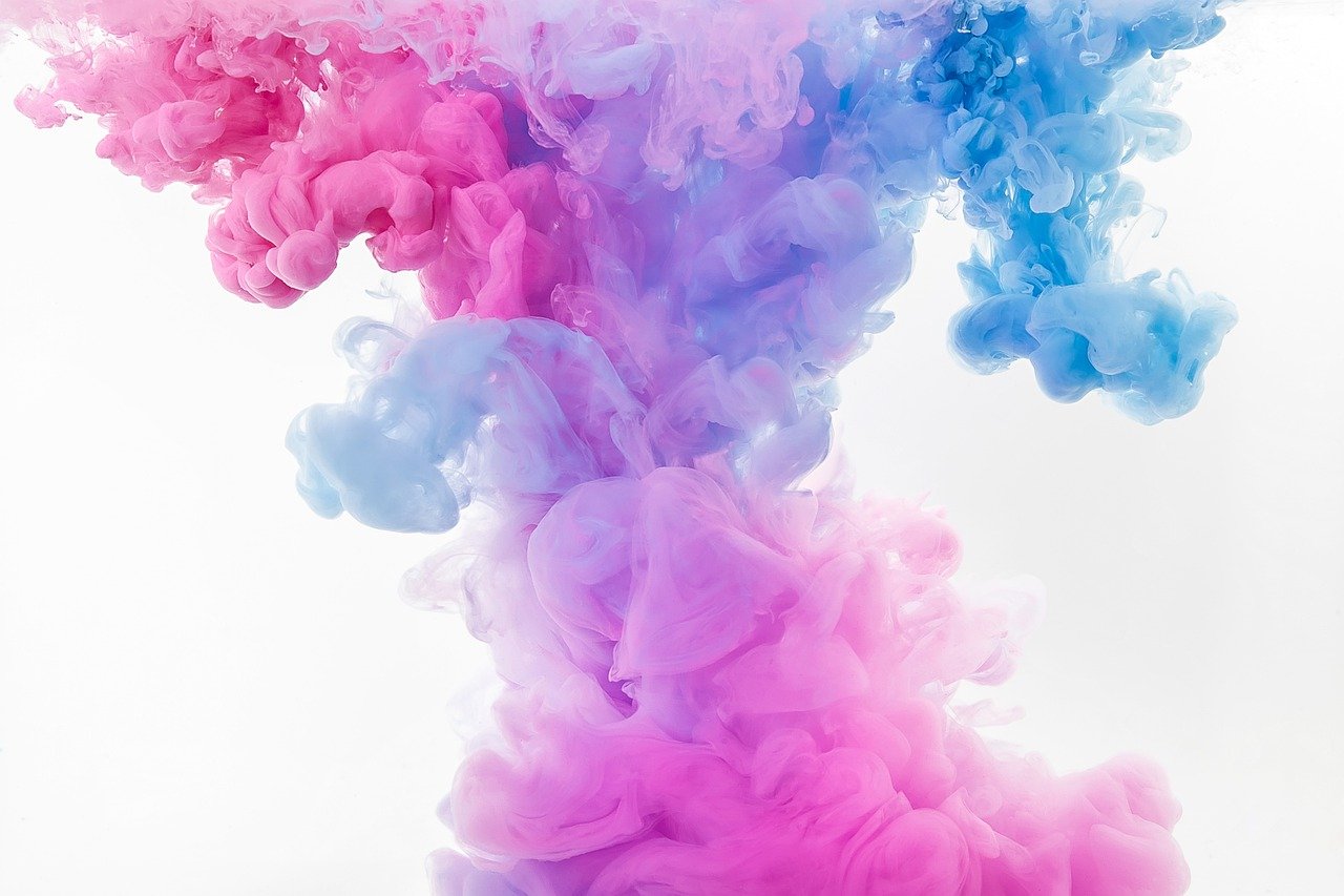
A Pinch of a Colour
Colours are the essence of graphic design. You can describe everything using the different nuances and shades. You can draw silence with a colour, the joy of life, and the sorrow of the dead. The great masters can use a single colour to give a radically different meaning to two or more designs. They use this method to provoke feelings and emotions on the opposite side, and because of that, this is one of the most powerful tools of modern graphic design.
The colours can be divided into primary, secondary – result of mixing primaries, and tertiary – result of mixing primaries and secondaries. Designers create schemes by combining colours standing differently on the colour wheel. The main types of colour schemes are Analogous, Complementary, Split-Complementary, Triad, Tetradic, and Square. You can study colours all your life and still not learn everything about their power over people’s minds.
Texture & Fonts
The texture is an essential element related to the physical graphic design rather than digital as it refers to the surface. On the other hand, today, professional designers can use advanced software allowing them to mimic different conditions – smooth, sticky, glossy, soft, rough, or furry. The cutting-edge tools create brilliant illusions making people willing to touch their screens. Mastering digital textures is tricky and difficult, but also an extremely important part of any graphic designer’s work. At the same time, every professional must be familiar with a great number of fonts.
Building typography requires knowledge and specific skills beyond the ordinary logo and slogan designing techniques. Choosing the most suitable font is only the first step, albeit a foxy and time-consuming one. The available typefaces are hundreds, so we would like to introduce only the main categories and a few examples:
- Serif – Garamond, Didot, Times New Roman
- Sans Serif – Helvetica, Proxima Nova, Futura
- Display – Brandon Grotesque, Gilroy, Spock
- Script – Monarda, Broadley, Hope Sans
- Monospaced – Alma Mono, Enigma, System Code.
No matter your personal or task preferences, keep in mind that different fonts and styles deliver different messages to users. For example, the bolding effect is a sign of attention. If the weight and importance of the thickened words or letters do not match, it’s likely for consumers to disregard the rest. Many people believe that colours and typing styles are the heart of every powerful graphic design, and we don’t think they are very far from the truth. However, there are other types of fillers too!
Empty Space & Images
Spacing is the graphic designer’s masterclass, especially if they plan to focus on logo designs and branding. The empty space provides the illusion of simplicity and minimalism, which modern users appreciate. It balances the other visual elements and significantly increases the visual impact. Spaces can be positive and negative, affecting differently on the users’ perceptions. Their role is fundamental if you want to add images too.
A great example of such a logo is the World Wide Fund for Nature (WWF)! It’s simple, easy to understand, and provides all of the essential information. Illustrations are a tricky little tool, which professional designers do not always prefer unless the task requires such. On the one hand, they do a great job if the goal is to grab the consumers’ attention. Then again, they often take up a lot of space and are difficult to see from a distance or at a small size.
Final Lines
As you can see, each of these simple elements has a key role in graphic design. The time you need to master any of them is the main resource for every professional. Today, you can do anything with so many tools and software, but to be familiar with them is another story. Perhaps that’s why it is so difficult to find a good graphic designer! Who knows, you might be the next Peter Saville and get the London Design medal!