Sheet 15 Revised 17 Aug 2026
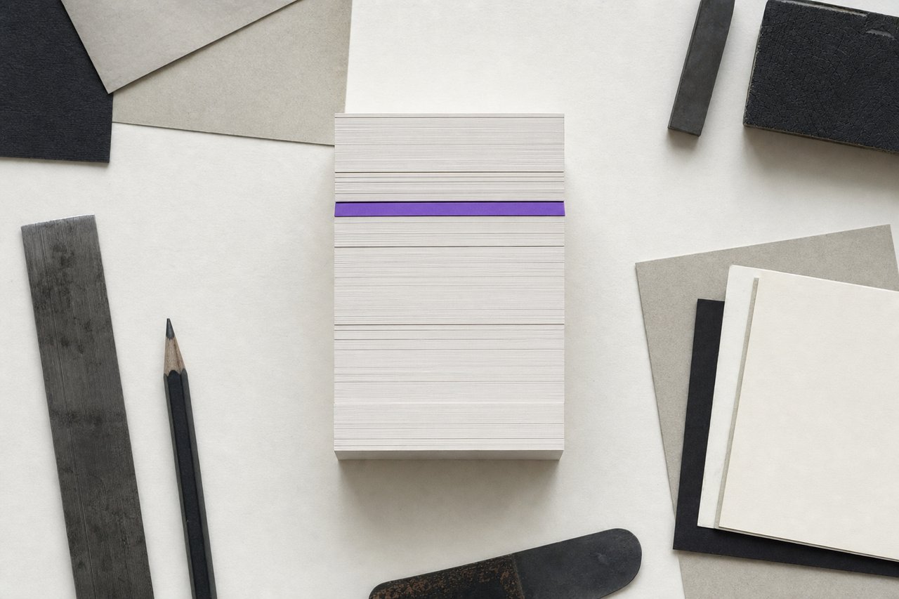
No. 519A flush stack is the whole idea. The one card out of place is the only one anybody sees.
Good branding and consistency: what a brand identity fixes, what moves, and the detail
Good branding is not about repeating the same layout until somebody remembers it. Brand consistency is a decision (which parts of a brand identity are fixed, and which are allowed to move) and then holding that line in the small places nobody is watching. That is where the detail decides it.
Consistency is not repetition
The two get conflated constantly, and the difference decides whether an identity survives contact with real use. Repetition is showing the same thing again. Consistency is showing different things that are recognisably from the same source.
An identity built on repetition produces materials nobody reads twice, and it collapses the first time somebody has a genuinely different problem to solve: a long-form document, a small badge, an interface. An identity built on consistency has a small fixed core and a large permitted range, and it handles the unexpected case because the range was designed to.
Good branding therefore starts by drawing a line, explicitly, between the two.
What a brand identity has to fix
Four things, and keeping the list to four is deliberate.
The mark. Same drawing, same proportions, same clear space, every time. Not recoloured, not stretched, not set on a background that was not approved. It is the only element present at every point of contact and it carries recognition alone in most of them.
The type. The faces and the scale, not the individual sizes. A brand identity that fixes exact pixel values breaks the first time somebody sets a spreadsheet header; one that fixes the faces and the ratio survives it.
The core colours. Two or three, specified in every space they will be reproduced in. The extended palette can be large; the core cannot, because a core of eight colours is not a core.
The proportions of the grid. Not the layout: the underlying relationships. The same margin logic and the same rhythm read as consistent even when the arrangement is completely different.
What has to move
An identity where nothing varies stops being read. Three things should be free, and saying so in writing is what prevents somebody defending the system by freezing it.
Layout. A poster and a form have different jobs. Holding the grid logic while changing the arrangement is exactly what the fixed core is for.
Imagery. The subject and the crop should respond to the content. What stays fixed is the treatment: the same relationship to colour, the same distance, the same honesty about what is being shown.
Register of voice. An error message and a launch announcement should not sound the same. The vocabulary and the attitude stay; the temperature moves.
The detail is where consistency is actually lost
Identities do not usually fail on the poster. They fail in the places nobody assigned to anybody.
- The email signature, where the mark is a JPEG somebody resized in 2019.
- The invoice template, made in a spreadsheet application with whatever face it defaulted to.
- The out-of-office message, which is the only writing many people will ever receive.
- The favicon, which is the mark at the smallest size it will ever appear and is frequently the full mark rather than the reduced variant.
- The form error messages, written by whoever built the form.
- The slide template, which acquires one new variant per quarter.
Each of those is low status and high frequency, which is exactly the wrong combination. The fix is not vigilance, vigilance does not scale, it is making the correct version easier to reach than the incorrect one. A template that is one click away beats a rule that is one document away.
A brand identity degrades by accumulation rather than by decision. Nobody chooses to use the wrong mark; somebody needs a version that is not in the folder, makes one, and it circulates.
Attention to detail as a signal in its own right
Brand consistency in small things carries information beyond recognition. A reader who sees a misaligned form field, a stretched logo in a footer and three different shades of the same brand colour on one page learns something about how the organisation works, and it is not about design.
This is why the detail is worth the effort even where nobody consciously notices it. Nobody notices correct kerning; everybody notices bad kerning, and what they notice is not the kerning.
Making good branding hold
Three things do most of the work of holding good branding in place, and none of them is a fifty-page manual.
One short document, actually read. A single page covering the mark, the type, the core colours, the grid logic and the three things that are free. Fifty pages is a document that gets filed; one page is a document that gets used.
Templates rather than rules. Every recurring artefact (signature, invoice, slide, social image, letter) as a working file. The rule tells somebody what to do; the template does it.
A periodic sweep. Once or twice a year, collect everything the organisation actually produced and look at it together. Consistency is not visible one item at a time, which is the whole reason it drifts. The checklist is written to be run this way.
Questions about consistency
QueriesWhy is consistency the key to good branding?
Because recognition is built by repetition, and repetition only accumulates when the thing being repeated is recognisably the same. Inconsistent application resets the count each time, which is why an identity that changes slightly everywhere never becomes familiar anywhere.
Does consistency mean everything must look identical?
No, and treating it that way produces materials nobody reads twice. A small fixed core (mark, type, core colours, grid logic) with a deliberately large permitted range is what handles a poster and a form without either looking foreign.
Where do brand identities usually lose consistency first?
In the low-status, high-frequency artefacts nobody was assigned: email signatures, invoice templates, slide decks, form error messages and favicons. They are seen far more often than the campaign work and are almost never in the guidelines.
How long should brand guidelines be?
Short enough to be read in one sitting. One page covering the mark, the type, the core colours, the grid logic and what is explicitly free will be used; a fifty-page manual will be filed. Templates carry the rest better than prose can.
How often should an identity be audited?
Once or twice a year, by collecting everything actually produced in that period and looking at it together rather than item by item. Drift is only visible in aggregate, which is precisely why it goes unnoticed for so long.
Read next
TransfersBrand consistency checklist
A sweep to run against everything produced in six months, starting with the artefacts nobody owns.
No. 265BrandingBrand identity vs brand
One is a folder you own, the other a belief you do not. Which is which decides what a project can fix.
No. 602Logo DesignLogo formats and files
The vector master, the SVG, the one-colour pair and the one-page note that stops a mark degrading.