

Best Fonts for Graphic Designers
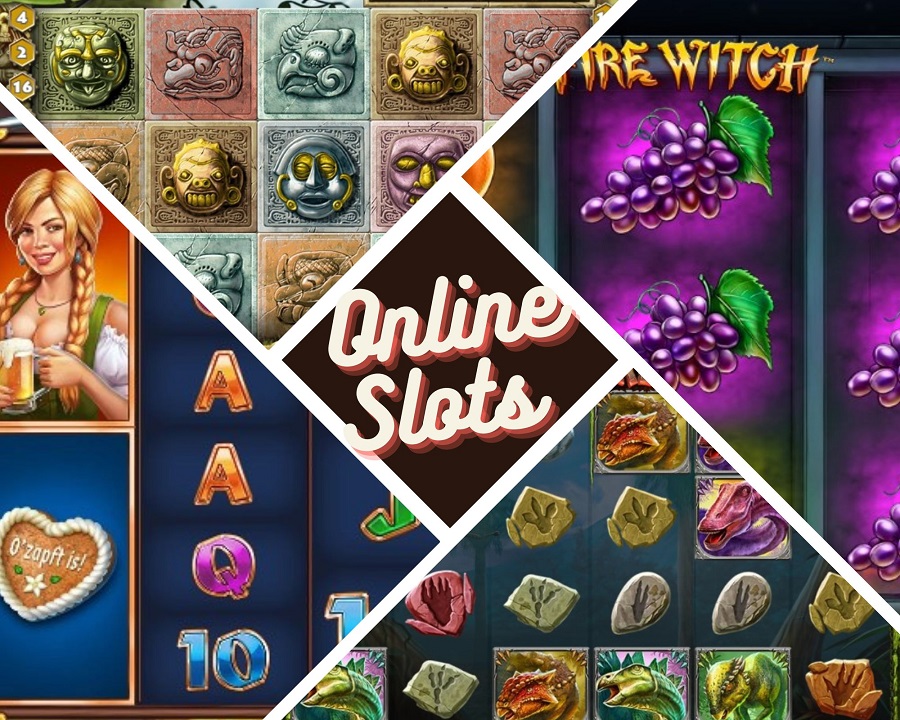
Today, content is everywhere! We are literally flooded with information no matter if we are at our workspaces, on the street, or browsing social media and the Internet. Graphic design is also a way to craft content for online distribution. If we went back a few years ago, it was used for making things prettier only, for adding a few special effects on a website or particular document. Graphic designers were mainly employed in the marketing departments, which in fact remains the case to this day.
However, the web, mobile, and digital technologies are reaching new heights of advancement every year. Things that were practically impossible in the past today are happening with a few clicks. A new era of graphic design and web development, we might say. Professional designers have new, higher-tech tools at their disposal to extend their artwork. No matter if you need a brochure, a unique frontend of a website, logos, slogans, or anything else, it’s now possible.
Of course, the final product depends on many factors and consists of many elements. Choosing the correct font for each task is one of them. Luckily, professional designers have plenty of options. In the next lines, we’ll present the best graphic design fonts.
How to Choose the Correct Font
Choosing the most suitable font for your graphic design project is often crucial for the final result. There are many factors to consider, but we believe that some of them have a really deep impact. Firstly, designers must understand the identity of the product they are going to work on. The typeface must fit perfectly, supporting the brand and not changing its nature. Readability and legibility are also essential! Make sure to stick to conventional shapes and types unless the instructions are completely opposite.
Experienced professional graphic designers know that versatility is the main requirement, often very hard to achieve. Another crucial factor is the selection of Serif, Sans, or another font family. The fast and correct choice is possible only if you understand the history of the marketed product. Finally, we suggest testing a few different fonts, individually and in combinations adding decisive contrast. Below, we’ll share the most popular typefaces.
Top Fonts Used by Professional Graphic Designers
As we mentioned before, web development and related crafts are evolving as we speak. However, professionals in graphic design prefer a few fonts, knowing that they will deliver the expected result in most cases. Here are the top five picks of our editors’ team:
- Helvetica
- Trajan
- Futura
- Garamond Pro
- Bodoni.
Helvetica and its variances are undoubtedly the most used typeface by senior and mid-senior designers and even by beginners. It provides unique characteristics to your product and simplicity so much cherished these days. Helvetica can be used for creating almost everything in terms of written content. The Trajan typeface, on the other hand, is a little less versatile. It combines beauty and authority, which is why it is widely used in modern cinematography. If you have looked at posters of different movies, you have certainly witnessed products designed with the Trajan font. However, if you look for a wider variety of versions, you might test Garamond!
It is used for designing online books, websites, blogs, news portals, and magazines. Garamond has been appreciated since its release in 1989 and is used by any agency worldwide. In terms of popularity, it is quite close to Helvetica, although they remain very difficult in almost every aspect. Garamond is a serif type of font, while Helvetica is sans-serif for a start. Another typeface without serifs on characters is Futura. It’s a very old font rediscovered by modern graphic designers in the last years. Futura is perfect for creating short slogans or inserting text in logos.
Designers can modify the content in various geometric shapes, like circles or triangles, thanks to the font’s geometric foundation. In short, Futura is great for use within limited spaces. Bodoni is the last graphic design font on our shortlist. It’s a serif typeface used by creative professionals to design unique masterpieces. The brilliant blend of thick and thin strokes makes Bodoni quite attractive and usable in the fashion industry. There are many reasons to choose these fonts or avoid them, and our purpose is only to mention them leaving the final decision to you. Once again, it all depends on the product, brand, and the original idea.
Alternative Fonts
Certainly, the graphic designers good at their job use not just the five typefaces we mentioned above but many others as well, mixing them for the optimal result. As you probably know, the main two types of fonts are serif and sans-serif, so we’ll group a few alternatives from both categories in the next few lines. We highly recommend testing the serif Didot, Bosca, Mirador, Tiempos Fine, Elgraine, Ogg, Hacky, and Pacho. On the other hand, many professionals love using the sans serif styles Proxima Nova, Jam Grotesque, Code Next, Spacia, Extatica, and Gilmer Sans.
Of course, we can’t finish this article without mentioning the masterful fonts from the Adobe family. If you want to give your content a unique and artistic touch, perhaps Bickham Script Pro could be an excellent fit. The Adobe Fonts platform offers most of the styles mentioned so far. It’s a great starting point for every new beginner!
Final Words
Graphic design is a key element of modern marketing. Each new product needs good advertising, and the way it is perceived visually by potential consumers is crucial. The people mastering this craft are often the link between sellers and buyers. Given the endless innovations in the digital world, we can expect more magic in future!