Sheet 10 Revised 15 Aug 2026
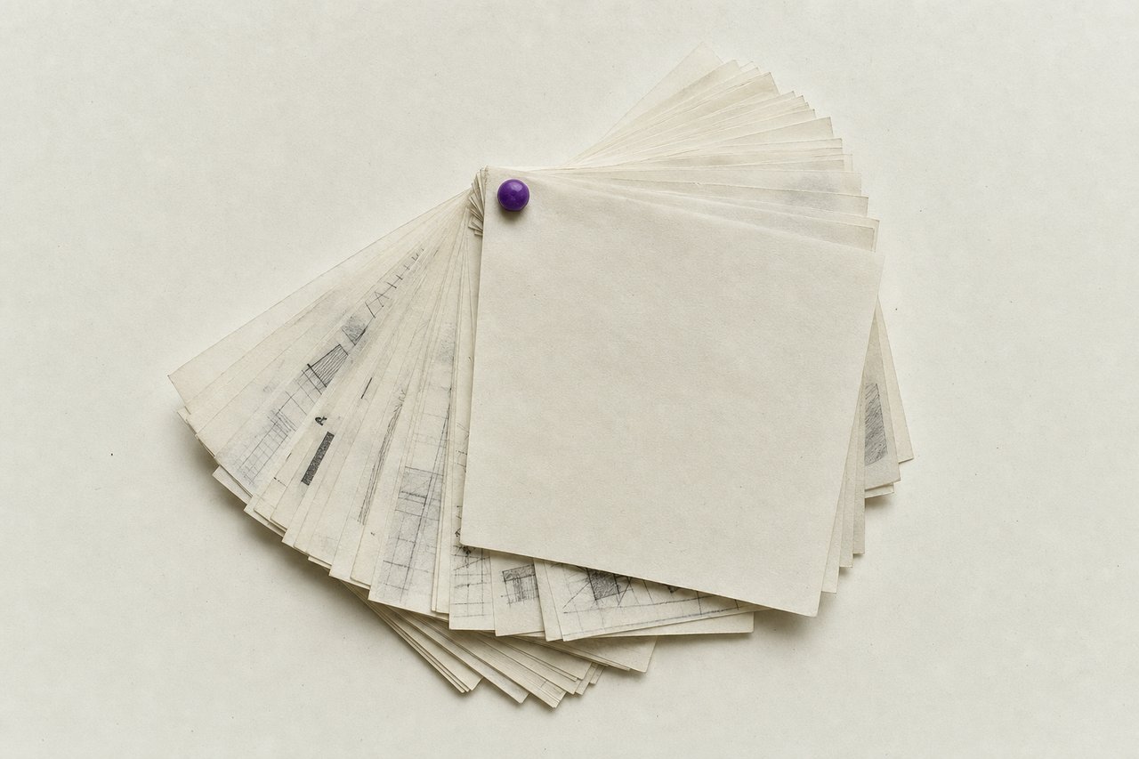
No. 077Sixty thumbnails, one pin. The pin is the process: everything stays until something rejects it.
How to make a good logo: the principles, the formats and the tests a mark has to survive
Knowing how to make a good logo is mostly knowing what to throw away and when. The order below moves from the brief to the final formats, and every stage has a rejection criterion attached, because a process without rejection criteria is a process that ends when somebody gets tired.
Before anything is drawn: how to make a good logo starts with three questions
Most weak marks are weak because the brief was never reduced to something answerable. Three questions do most of that reduction, and answering them is where knowing how to make a good logo actually begins.
Where will it be smallest? Not where it will be biggest. The smallest usage is the constraint, and it is usually a favicon, an application icon or an embroidered chest badge. Everything about the mark's level of detail follows from this answer.
What is it standing next to? Distinctiveness is relative. A mark is designed into a field of competitors, and the field is knowable before the first sketch.
What has to be readable, and what merely has to be recognised? A name has to be read. A symbol only has to be recognised, and once recognised it can be almost anything. Confusing the two is how a mark ends up with an illegible symbol carrying the work a wordmark should be doing.
Thumbnails: quantity, on paper, small
Draw at the size of a postage stamp, in pen, forty or sixty of them, without stopping to evaluate. Two things happen. The size forbids detail that would not survive anyway, and the volume gets past the five or six obvious ideas that everybody has in the first ten minutes.
The obvious ideas are worth drawing precisely so they can be crossed out. A mark that has not survived its own cliché has not been tested against it.
The principles, applied as tests that reject
Take the survivors to a screen and apply the tests in order. The order matters because the first one is the cheapest and kills the most.
- Sixteen pixels. Render it that small. Counters filled in, shapes merged, or an indistinct blob: rejected, or redrawn as a reduced variant.
- One ink. Solid black on white, then solid white on black. Both have to work.
- Silhouette. Fill it flat, remove internal detail. Generic outline, generic mark.
- Six-second recall. Show it, hide it, ask for a drawing. What comes back is the mark.
- Its field. Put it beside the marks it will appear with. Distinctiveness is relative and cannot be judged on an empty artboard.
The five are given in order, with what each one is actually detecting, on the principles page.
Construction: geometry serves the eye, not the other way round
Draw the survivor properly. Consistent stroke weights, deliberate optical corrections, as few anchor points as the shape genuinely needs.
Two corrections come up in nearly every mark, and both are cases where the mathematically correct answer looks wrong. A circle beside a square at the same nominal height looks smaller and has to be drawn slightly larger. A horizontal bar at the same thickness as a vertical one looks heavier and has to be drawn slightly thinner. The eye is the client, not the ruler.
Grid overlays and golden-ratio constructions are a presentation device far more often than a design method. There is nothing wrong with using one to keep proportions consistent; there is something wrong with presenting one as the reason the mark is good.
Type, if the mark carries a name
A wordmark is a typographic problem before it is a logo problem. Start from an existing face with the right skeleton, then adjust: tighten the spacing, correct the pairs the font handles badly, and modify individual letters only where the modification does work.
Two constraints govern. The face must be licensed for the use, and outlines must be converted before the artwork is delivered so the file does not depend on a font being installed. The licensing entry covers what a desktop licence does and does not permit here, which is the point most often got wrong in logo work.
Colour, last
The mark should already work before colour arrives. Then a small palette (one primary, one or two supporting) specified in every space it will be reproduced in, and checked for contrast against the backgrounds it will actually sit on rather than against white.
Two practical checks. The mark in a single flat colour on its own brand background, and the mark reversed out of it. If either fails, the colour is decorating a structural problem.
Delivery: the formats that leave the studio
A logo is delivered as a set of files rather than a file, and the set is not negotiable if the mark is going to be used correctly by anyone who was not in the room. A primary vector master, a reduced variant, one-colour positive and negative versions, raster exports at the sizes actually needed, and a short usage note covering clear space and minimum size.
Formats and files covers exactly what goes in the folder and why each item is there. Getting this wrong is the most common way a good mark degrades within a year of delivery.
The failure modes, named
The mark that only works large. Detail beyond what the smallest usage can carry. Fix with a reduced variant, not with wishful thinking.
The mark that only works in colour. Structure carried by hue instead of by shape. Fails on the first one-ink reproduction.
The mark that is a trend. Gradients, blurred meshes and geometric-lion illustrations all date on a schedule. Nothing wrong with a contemporary mark; something wrong with one that will be legible about the year it was made.
Each of the four below is a way of not knowing how to make a good logo while producing one anyway.
The mark that describes. A symbol that spells out what the organisation does is a symbol that has to be redrawn when the organisation does something else.
Questions about making a mark
QueriesHow long should it take to make a good logo?
The drawing is not the long part. Reducing the brief to the three questions above, and then applying rejection criteria honestly, is what takes time. A mark that arrives quickly and passes the five tests is finished; one that arrives quickly and has not been tested is a sketch.
Do I need a symbol as well as a wordmark?
Only if there is a place a wordmark cannot go. An application icon, a profile picture and an embroidered badge are the usual three. If none of those exist, a strong wordmark alone is a complete answer, and it is one less thing to have to teach an audience.
What is the minimum size a logo should work at?
Sixteen pixels square is the working floor for anything that will appear online, because that is the favicon size. In print the equivalent is around ten millimetres wide. Design to that first and everything larger takes care of itself.
Should a logo be built on a grid or the golden ratio?
A grid is useful for keeping proportions consistent while drawing. It is not evidence of quality, and a construction diagram presented as the justification for a mark is a presentation technique rather than an argument. The tests are the argument.
Can a good logo use more than two colours?
It can, but every additional colour is another way for the mark to fail in one-ink reproduction, and another specification somebody has to get right. If a colour is not doing structural work, it is a cost.
Read next
TransfersLogo formats and files
The vector master, the SVG, the one-colour pair and the one-page note that stops a mark degrading.
No. 519Logo DesignLogo presentation
Show the mark, then show it small, then explain, and why the format decides the question the room answers.
No. 331Logo DesignPain and gain in a mark
Three devices for holding two opposed ideas in one shape, and the four ways that kind of mark breaks.