Sheet No. 01 · Dry transfer lettering · a graphic design reference for type, logo and branding craft
Creative Hat, a graphic design reference for type, logo and branding craft
Eleven letters above, eleven different display faces, one from each sheet. That is what this graphic design reference is about: how typefaces are classified, chosen and paired, and how the same judgement carries into marks, logos and the everyday decisions of the craft. Press the button and watch what alignment actually buys you.
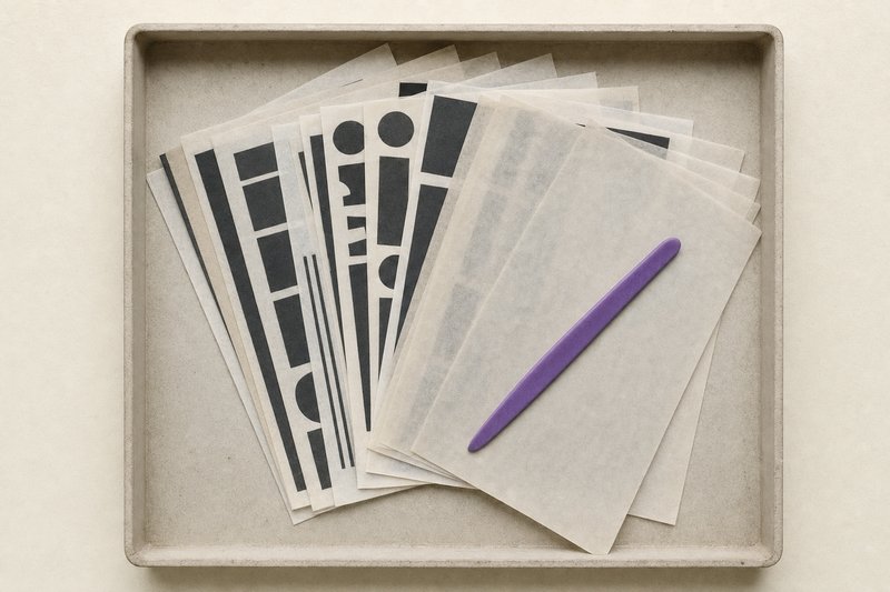
What this graphic design reference covers
Sheet 01Creative Hat is a graphic design reference built around one idea: almost every decision in the craft is a judgement that can be reduced to a measurement, and almost none of them are worth arguing about once the measurement is on the table. A face is not too small, it has a low x-height. A mark does not feel weak, it loses its counters at sixteen pixels.
The reference is organised into five sections. Type and typefaces is the largest, because it is where the measurements are most useful and least often taken. Logo design and branding follow the same judgement into marks and into the systems built around them. Tutorials cover the drawing technique underneath all of it, and fundamentals covers the vocabulary the other four assume.
Every entry states what it measured and at what size. Where a figure is drawn here, its construction is given in the caption, and where a number comes out of a file rather than an opinion, the file is named. That is the whole editorial standard, and it is the reason this graphic design reference is shorter than it could be.
Entries are revised in place rather than republished. A guide to font licensing that was written once and left is a guide to font licensing as it used to be, and the terms move. The date on each entry is therefore the date it was last revised, not the date it first appeared, and the reference index further down this page is sorted by it.
One entry is a record rather than a guide. A family of twelve free display typefaces was released through the free-font directories between 2008 and 2013, and eleven of the twelve carry terms that do not permit commercial use. Those releases are recorded and credited, with the terms on each one stated, and the files are left where they are rather than mirrored.
Nothing here is for sale, nothing can be commissioned, and no design work is undertaken. It is a reference, and the only thing it asks a reader to do is check the measurement.
Where to start
Transfers 01–05Best fonts for graphic designers
Forty-one faces grouped by the job they do, each with its class, its designer and the licence you actually get.
No. 077Logo DesignHow to make a good logo
Why a mark survives being shrunk to sixteen pixels, and the five tests that decide it before any colour is chosen.
No. 519BrandingKey to good branding
Consistency is not repetition. What has to stay identical, what has to move, and where the line is lost.
No. 132TutorialsVector phone tutorial
A hard-surface object from primitives, with the boolean operations named as they are used.
No. 045FundamentalsBasic elements of graphic design
Line, shape, space, scale, texture and colour: defined tightly enough to argue with.
Type and typefaces
Fig. 01 · six skeletonsSix families, one skeleton. Each capital below is built on the same frame (apex at the same point, feet at the same width, crossbar at the same height), and only the four features that define a family are changed: the ratio of thin stroke to thick, the form of the serif, the bracket where serif meets stem, and the axis. The ratio printed under each is the ratio drawn in it.
Fig. 1 · Drawn rather than typeset, because the display faces available here are not members of the classes they would otherwise have been labelled with, and a figure that contradicts its own caption teaches the wrong thing twice.
Logo design and branding
Sheet 02A logo is judged by what survives. Shrunk to sixteen pixels, printed in one colour, stitched into fabric, read at forty miles an hour: the mark that comes through all four is the mark that works, and everything else is a preference. The logo section works through the tests in the order they should be applied, which is smallest first.
Branding is the layer above it, and the word covers two different things that are worth keeping apart. There is the identity, which is the set of assets and rules, and there is the brand, which is what a reader already believes before any of them are shown. The distinction decides which problems a redesign can actually solve.
The two are covered in the order they are decided in. What a mark has to survive comes first, because it constrains everything drawn afterwards; what an identity fixes and what it lets move comes second, because that question cannot be answered until there is a mark to fix. The consistency checklist is the third step and the only one that is run repeatedly.
The reference index
Sheet 03 · 24 entries| Entry | What it covers | Section | Revised | Open |
|---|---|---|---|---|
| Free display typefaces | The twelve free display faces one designer released, what the catalogues still list, and what the terms permit. | Type & Typefaces | 24 Aug 2026 | Open Free display typefaces |
| Anatomy of a typeface | Every part named, and the five lines measured out of the font file this page actually serves. | Type & Typefaces | 20 Aug 2026 | Open Anatomy of a typeface |
| Typography glossary | Around seventy working terms, grouped by what they describe and defined by what each one changes. | Glossary | 19 Aug 2026 | Open Typography glossary |
| Basic elements of graphic design | Line, shape, space, scale, texture and colour: defined tightly enough to argue with. | Fundamentals | 19 Aug 2026 | Open Basic elements of graphic design |
| Best fonts for graphic designers | Forty-one faces grouped by the job they do, each with its class, its designer and the licence you actually get. | Type & Typefaces | 18 Aug 2026 | Open Best fonts for graphic designers |
| Key to good branding | Consistency is not repetition. What has to stay identical, what has to move, and where the line is lost. | Branding | 17 Aug 2026 | Open Key to good branding |
| Type in practice | Body size, ratio, leading and measure: how the decisions on paper become a scale a real page can hold. | Type & Typefaces | 16 Aug 2026 | Open Type in practice |
| How to make a good logo | Why a mark survives being shrunk to sixteen pixels, and the five tests that decide it before any colour is chosen. | Logo Design | 15 Aug 2026 | Open How to make a good logo |
| Font pairing | The four working rules, and a bench that sets any pair at the size, leading and tracking it will really be used at. | Type & Typefaces | 14 Aug 2026 | Open Font pairing |
| What is branding | Brand, identity and logo are three different objects, and only one of them can be redesigned. | Branding | 13 Aug 2026 | Open What is branding |
| Font licensing | Open, free-for-personal-use, and the separate desktop, web and application rights, and which one governs. | Type & Typefaces | 12 Aug 2026 | Open Font licensing |
| Type classification | The six classical families and the four features (contrast, serif, bracket, axis) that separate them. | Type & Typefaces | 11 Aug 2026 | Open Type classification |
| Logo design principles | Five tests a mark has to pass, ordered so that the one which kills most candidates is applied first. | Logo Design | 10 Aug 2026 | Open Logo design principles |
| Tutorials | Vector technique named by operation rather than by menu, so it survives the next release. | Tutorials | 09 Aug 2026 | Open Tutorials |
| Logo formats and files | The vector master, the SVG, the one-colour pair and the one-page note that stops a mark degrading. | Logo Design | 08 Aug 2026 | Open Logo formats and files |
| Vector basics | Primitives, booleans, paths, and the habits that keep a drawing editable a year after it is finished. | Tutorials | 07 Aug 2026 | Open Vector basics |
| Logo presentation | Show the mark, then show it small, then explain, and why the format decides the question the room answers. | Logo Design | 06 Aug 2026 | Open Logo presentation |
| Brand identity vs brand | One is a folder you own, the other a belief you do not. Which is which decides what a project can fix. | Branding | 05 Aug 2026 | Open Brand identity vs brand |
| Pain and gain in a mark | Three devices for holding two opposed ideas in one shape, and the four ways that kind of mark breaks. | Logo Design | 04 Aug 2026 | Open Pain and gain in a mark |
| Brand consistency checklist | A sweep to run against everything produced in six months, starting with the artefacts nobody owns. | Branding | 04 Aug 2026 | Open Brand consistency checklist |
| Vector phone tutorial | A hard-surface object from primitives, with the boolean operations named as they are used. | Tutorials | 03 Aug 2026 | Open Vector phone tutorial |
| Illustrator versus CorelDRAW | Four differences that survive scrutiny, and the reason none of them is about drawing. | Tutorials | 02 Aug 2026 | Open Illustrator versus CorelDRAW |
| Design fundamentals | The elements are nouns and the principles are verbs, and most confused feedback mixes the two. | Fundamentals | 01 Aug 2026 | Open Design fundamentals |
| Colour and contrast | The ratios, why the threshold moves with type size, and the places colour is not allowed to work alone. | Fundamentals | 30 Jul 2026 | Open Colour and contrast |
What this is
Sheet 04Creative Hat is a graphic design reference on type and design craft. It explains how typefaces are classified, how they are paired, what their licences permit, and how the same judgement carries into a logo, an identity and a page of layout.
Entries are written against named sources and revised in place rather than republished, so the dates above are revision dates. Where a figure is drawn here, its construction is stated in the caption. Where a measurement is quoted, the file it came out of and the size it was taken at are both given, because a measurement without its conditions is an opinion with a number attached.
One section is a record rather than a guide: a family of twelve free display typefaces distributed through the free-font catalogues, each entry described and credited to its release. This reference does not host the files, does not offer design services, and does not accept commissions.
Questions about this reference
QueriesWhat is this graphic design reference for?
Working decisions rather than inspiration. Each entry sets out how something is judged: which family a face belongs to, whether two faces can sit together, whether a mark survives being shrunk, and states the measurement the judgement rests on.
Does this site offer design services?
No. It is a reference and nothing is for sale on it. No design work is undertaken here, no commission is taken, and nothing on the site can be bought, briefed or booked. The entries are the whole of what it does.
Can the twelve free display typefaces be downloaded here?
No. The catalogue entry for each one records the current file and the current terms, so the display catalogue links to those listings rather than re-hosting anything. Eleven of the twelve are free for personal use only, which is a distinction that matters a great deal in commercial work.
How often are the entries updated?
Entries are revised in place rather than republished, so the date printed on each one is the date it was last revised. The reference index below is sorted by that date.