Sheet 08 Revised 16 Aug 2026
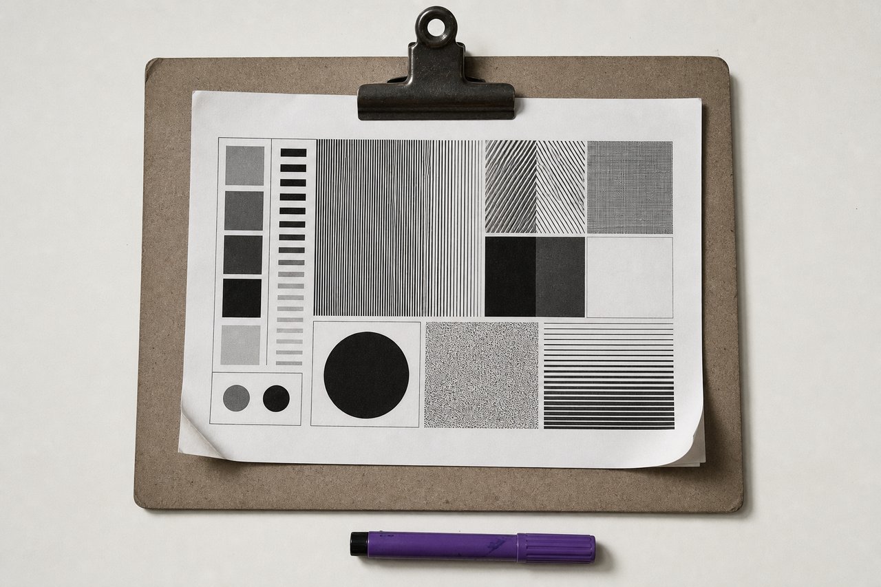
No. 190A proof is where a decision stops being a preference. Nothing survives it unchanged.
Type in practice: from a chosen face to a working type scale
Everything on this reference up to here is a decision made on paper. A type scale is where those decisions meet a real column width, a real reading distance and a real set of screens, and where most of them turn out to need adjusting by one step in one direction.
Start from the body size, never from the heading
The body size is the only size on a page that is determined by something outside the design: the distance between the reader's eye and the surface. A phone held at thirty centimetres and a monitor at seventy do not want the same number, which is why a fixed pixel body size is always wrong somewhere.
Set the body first, at the size it has to be read at, and derive everything else from it. Choosing a dramatic heading size first and then working down is how pages end up with sixteen-pixel body copy under a seventy-two-pixel headline and nothing in between that makes sense.
Build the scale from ratios, then break it
A scale built on a constant ratio: 1.2, 1.25, 1.333: gives sizes that relate to one another without anyone having to justify each number. The larger the ratio, the more dramatic the hierarchy and the fewer usable steps before the top of the scale leaves the screen.
Then break it in exactly two places. The first is at the top, where a fluid clamp between a minimum and a maximum serves a phone and a wide monitor better than any fixed step. The second is wherever two adjacent steps turn out to be visually indistinguishable: a scale with two levels a reader cannot tell apart has one level and a bug.
Leading belongs to the measure, not to the size
The common advice to set leading at around 1.5 is a starting point that ignores the variable that actually drives it. Leading has to increase with line length, because the longer the line the further the eye travels to find the start of the next one, and it has to increase with x-height, because a face that fills its line more needs more space around it.
A short measure at a small x-height can sit at 1.4 and look generous. A long measure at a large x-height will look cramped at 1.6. The number is an output, not an input.
Measure: the constraint that decides the rest
Between roughly 45 and 75 characters per line, with the middle of that range as the target. Wider is where readers lose their place returning to the left edge; narrower is where the eye returns so often that the rhythm breaks.
This page holds its reading column at 46 rem, which lands near the top of that range at the body size in use. Everything to the right of it (plates, tables, cross-references) exists because a column capped for readability inside a wide sheet would otherwise leave a large area of the page blank, and blank area next to text is what makes a page look unfinished rather than spacious.
Hierarchy from three variables, not from more faces
Size, weight and space produce essentially every hierarchy that is needed. A second family adds a fourth variable but also adds a font file, a licence and a decision to re-make on every page.
Which faces those are is settled before any of this: the catalogue of faces is where a text face is chosen for holding up in a paragraph and a display face for surviving at one size only. A scale is built on top of that choice and cannot rescue a face that was wrong for the job.
Where a second family genuinely earns its place is where the two levels have different jobs rather than different importance: a display face for the things that announce, a text face for the things that explain. That is the pairing this site uses, and the reasoning is on the pairing bench.
What a real page forces you to change
The heading is too big on the phone
Almost always. A heading sized for a wide screen wraps to four lines on a narrow one and stops being a heading. Fluid sizing between a floor and a ceiling fixes it in one declaration; media-query steps fix it in four and get out of sync.
The display face has closed up
Check the subheading level. Display faces are drawn for one size range, and the second or third level of a scale is usually below it. Either promote the face to the top level only, or replace it at the lower levels with a weight of the text face.
The justified column has rivers
Turn hyphenation on. Justification redistributes space into the word gaps, and without hyphenation those gaps have to absorb the whole adjustment. The two are a pair and shipping one without the other is the most common typographic defect on the web.
Nothing is wrong but it looks busy
Usually too many steps. Four levels of heading, three weights and two families is nineteen possible combinations and a reader who cannot tell which is which. Remove a level.
The one thing worth writing down
Record the scale (the body size, the ratio, the measure, the leading rule, and which face carries which level) in one short document at the point it is decided. Not because it is complicated, but because six weeks later somebody adds a page, guesses a size, and the whole thing drifts one step at a time until nobody can say what the original decision was.
Questions about setting type
QueriesWhat body text size should a website use?
Around 16 to 18 pixels for most content sites, set in a relative unit so a reader who has changed their browser default gets what they asked for. The number matters less than the relationship: the body size is chosen for reading distance, and every other size is derived from it.
How do I choose a type scale ratio?
Start at 1.25 for interfaces and dense content, and 1.333 or higher for editorial pages that want drama. Then check the actual steps: any two adjacent sizes a reader cannot tell apart should be merged, and any step that leaves the screen on a phone should be clamped.
Should body text be justified on the web?
It can be, provided hyphenation is switched on and the measure is long enough to absorb the adjustment. Justified text without hyphenation opens rivers of white down the paragraph, and on a narrow measure it does so severely. The two settings belong together.
How many heading levels does a page actually need?
Two below the title in most cases, three at the outside. More levels than a reader can distinguish at a glance is not a hierarchy; it is a set of sizes. If a level exists only because the document outline needed it, style it to look like its parent rather than inventing a size.
Read next
TransfersBest fonts for graphic designers
Forty-one faces grouped by the job they do, each with its class, its designer and the licence you actually get.
No. 519Type & TypefacesFont pairing
The four working rules, and a bench that sets any pair at the size, leading and tracking it will really be used at.
No. 408Type & TypefacesAnatomy of a typeface
Every part named, and the five lines measured out of the font file this page actually serves.