Sheet 24 Revised 30 Jul 2026
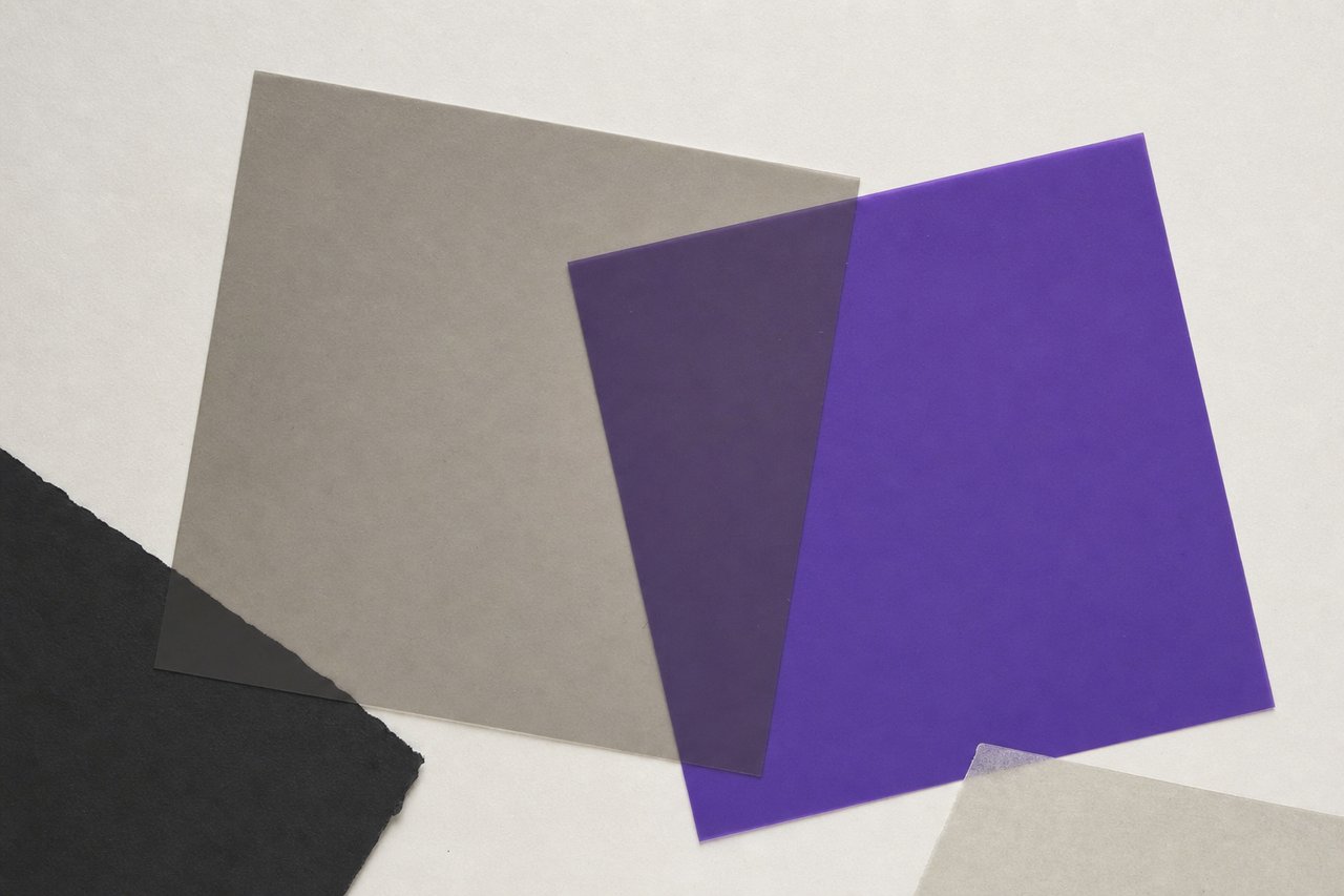
No. 265Two filters, one overlap. What matters is not either colour but the relationship between them.
Colour and contrast: the measurable part, and the judgement
Half of colour is a judgement and half is arithmetic, and the arithmetic half is the half that gets skipped. A contrast ratio is computed rather than perceived, the threshold moves with type size, and a pair that passes at one size fails at another, which is the fact most often got wrong.
What a contrast ratio actually measures
A contrast ratio compares the relative luminance of two colours: how much light each one emits or reflects, weighted for how sensitive the eye is to red, green and blue. The result runs from 1:1, two identical colours, to 21:1, pure black against pure white.
It is deliberately not a measure of how different two colours look. Two colours can be strikingly different in hue and nearly identical in luminance, in which case the ratio is close to 1:1 and the text is unreadable no matter how vivid the pair appears on a designer's screen. Red on green is the classic case.
The thresholds, and the one that moves
Normal text requires 4.5:1. Large text requires 3:1. User interface components and meaningful graphics require 3:1. The higher standard asks for 7:1 on normal text and 4.5:1 on large.
Large means 24 pixels, or 18.66 pixels when bold. That threshold is the detail that catches people: a heading that comfortably passes at 28 pixels fails the moment it is set at 20, and nothing about the colours changed. Any colour pair used across a range of sizes has to be tested at its smallest use, not at its largest.
Measured, not estimated
The ratios on this page are computed rather than judged. White on the violet field this site is set on measures 6.05:1, which passes for normal text with margin. The ink used for body copy on the white sheets measures 17.4:1. The deeper violet used for links and small labels on white measures 8.7:1.
Two colours are used here that pass nothing and are never allowed to carry text: the inherited grey from the original wordmark, at about 3:1 on white, and the gold from the hatband, at about 1.9:1. Both draw lines and shapes, and neither sets a word anywhere on the site. That is a constraint arrived at by measurement rather than by taste, and it changed the design.
Where colour must not work alone
A distinction carried by colour and nothing else does not exist for a substantial number of readers. The requirement is not that colour be avoided but that it never be the sole carrier.
- A link inside a paragraph needs an underline, a weight change or a background treatment as well as a colour. This site draws a rule under links on hover and marks them by weight at rest.
- A required field needs a mark or a word, not a red border alone.
- A chart needs labels, patterns or direct annotation, not a colour key alone.
- An error and a success state need different words or icons, not only different hues.
The judgement half
Everything above is arithmetic. What arithmetic does not decide is which colours, how many, and what they are asked to mean.
Fewer is stronger. One colour doing real work is more legible as an identity than six sharing it. An extended palette is for charts and states, not for the core.
Hue carries association, and the association is local. Colour meanings vary between cultures and between industries, and a palette chosen for connotation should be checked against the audience rather than against a chart of universal meanings, which do not exist.
Context beats swatch. A colour is perceived relative to what surrounds it. The same violet reads as vivid against white and as muted against black. Judge a palette in the arrangement it will be used in, at the sizes it will be used at, never as swatches on a neutral ground.
Test in the medium. Screen colour is emitted, print colour is reflected, and a colour that is brilliant on a monitor may be unreachable on uncoated stock. Where an identity has to work in both, the printed version constrains the choice and the screen version follows.
A short procedure
- Choose the pair for the smallest text it will ever set, and compute the ratio rather than judging it.
- Check every combination that will actually occur, not just the approved pair: including text on the brand colour and the brand colour on white.
- Confirm no distinction anywhere is carried by colour alone.
- Look at it in place, at real sizes, on more than one screen.
- If it also prints, decide it against the printed version.
The elements this sits inside are covered on the elements entry, and the type sizes that decide which threshold applies come out of the type scale.
Questions about colour
QueriesWhat contrast ratio does text need?
4.5:1 for normal text and 3:1 for large text at the AA level, rising to 7:1 and 4.5:1 at AAA. Large means 24 pixels, or 18.66 pixels when bold, which is why a pair that passes as a heading can fail as a subheading without either colour changing.
Why do two very different-looking colours sometimes fail contrast?
Because the ratio compares relative luminance, not hue. Two colours can differ dramatically in appearance and be nearly identical in luminance, which puts the ratio close to 1:1 and makes text in one on the other unreadable. Red on green is the standard example.
Can a link be shown by colour alone?
No. A distinction carried only by colour does not exist for readers who do not perceive that difference. A link needs an underline, a weight change or some other non-colour cue in addition to the colour.
How many colours should a palette have?
A core of two or three, extended only where states and data genuinely need more. A core large enough to cover every eventuality is not a core, and it makes the identity harder to recognise rather than more flexible.
Read next
TransfersBasic elements of graphic design
Line, shape, space, scale, texture and colour: defined tightly enough to argue with.
No. 602FundamentalsDesign fundamentals
The elements are nouns and the principles are verbs, and most confused feedback mixes the two.
No. 190Type & TypefacesType in practice
Body size, ratio, leading and measure: how the decisions on paper become a scale a real page can hold.